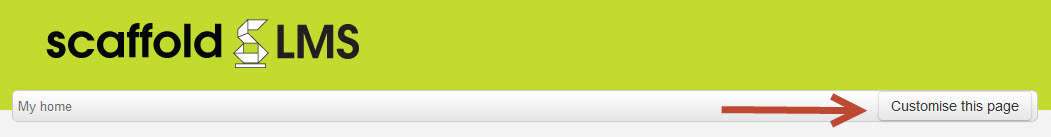
Customise this page
To access the administration area first select Customise This Page while on the site home page (this may instead show as Turn Editing On on your site)
Adding charts
To add charts select the Edit icon in the corner of one of the panel spaces.
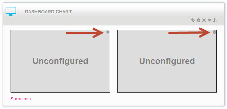
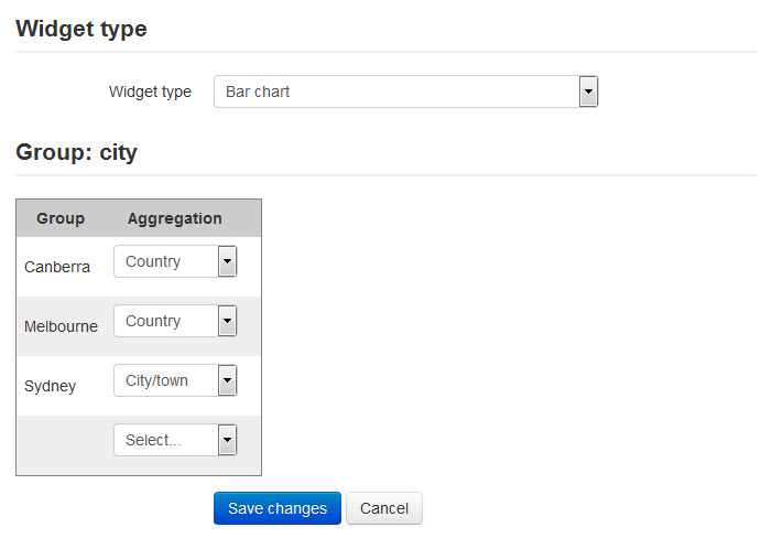
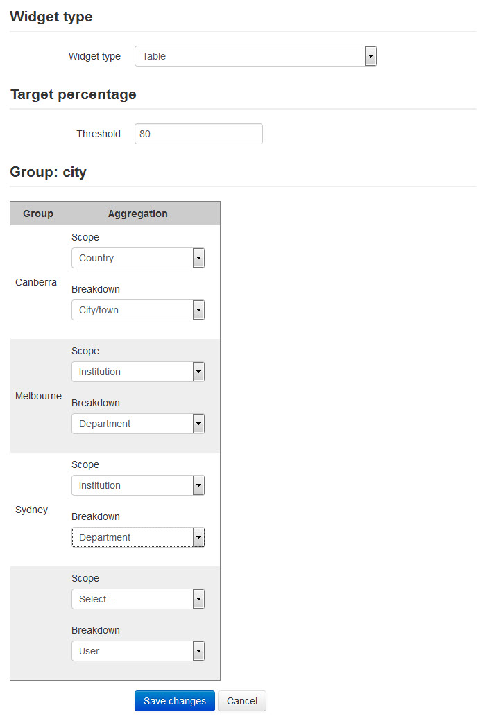
Chart types
You can choose from one of three Widget types.
In the examples below the Group of City has been chosen, so different chart sets can be selected for the users in Canberra, Melbourne and Sydney.
You can also see a fourth set of options with no title. This for anyone who doesn't have a city recorded in their profile.
Pie Chart
This chart shows the percentage of course completions achieved - as a combined total for all the chosen courses - by the chosen aggregation group. You can add multiple pie charts to a single panel, with the size of the charts and the height of the panel adapting to fit.
Select a set of pie chart aggregations for each group, selecting Add each you want to add another.

Bar Chart
This chart shows the percentage of course completions achieved for each course by the chosen aggregation group.
Choose a single aggregation for each group.
Table
The table presents a column for each course, and a row for each Breakdown within the chosen Scope - for example, every State within a Country or every User within a Store. Each cell is coloured either green or red depending on whether that breakdown has fulfilled the completion percentage you have specified in the Threshold.
Because this can become quite a long table depending on the chosen scope and breakdown (I don't recommend every User within the Country!), the Fold from second layout option is recommended (see Configuring a Dashboard Chart). If your table is in the second or subsequent panel it won't display every time the user goes to the site home page, only when requested.
Comments